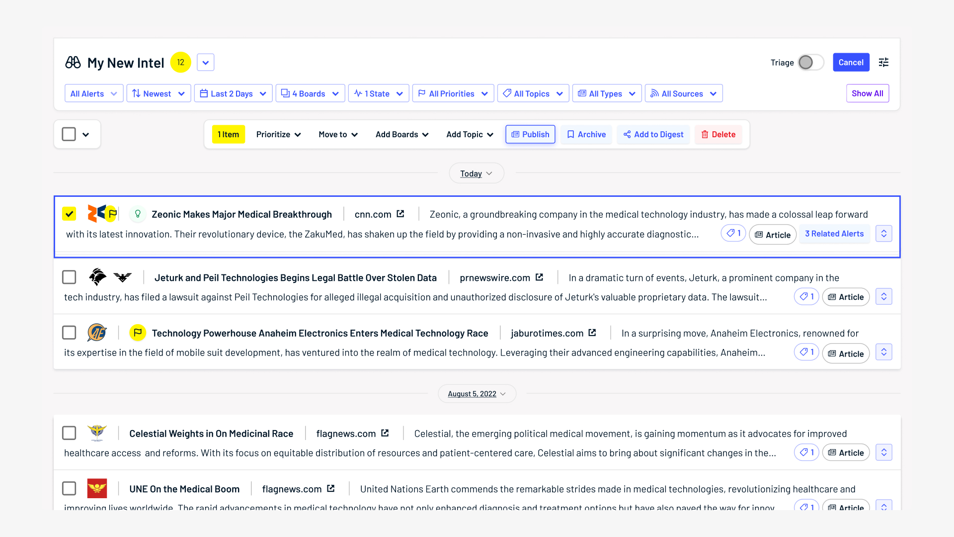
Alerts List View
List View is a feature release designed to consolidate data for Alerts, Klue's competitor intelligence aggregation and management platform. It enables the ability to efficiently filter out irrelevant information and highlight critical competitor news, addressing the increasing needs of users as they become more experienced with leveraging Klue in their workflows.
Note: The content shown in the visuals of this portfolio project have been fabricated to safeguard Klue’s customer data, and any resemblance to actual companies, products, or events is purely coincidental.
Role
Lead UI/UX Designer
Timeline
2 months (Jul - Aug 2022)
Responsibilities
Product Strategy, UI & Interaction Design, UX Research, Design Component Creation, Documentation
The Results
•
3x the number of list items shown simultaneously
•
25% increase in task efficiency
•
42% improvement in user retention rate
“Condensing all of this great information is awesome. Now I
can do more with less.
- VP of Sales @ Fortune 500 tech company
“Having access to more intel at a time is extremely valuable,
especially when actioning multiple
pieces.
- Account Executive @ S&P 500 tech company
The Goal
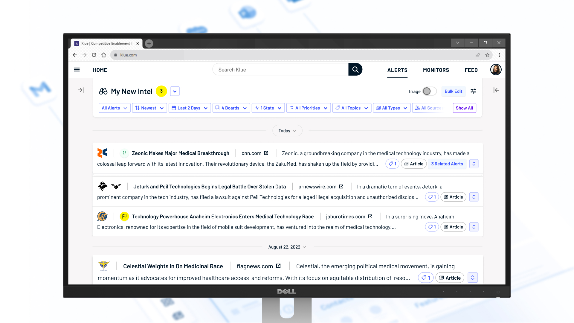
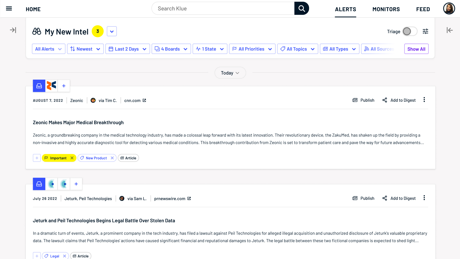
Design a compact view for this 👇 to save experienced users time and effort when working with competitor intel.
Break down, break down
Determining the most important data for users gave clarity on next steps.
Speaking with experts
An initial prototype was made to test with users. My PM and I conducted qualitative research with 3 of Klue's most avid users to better cater the solution to experts.
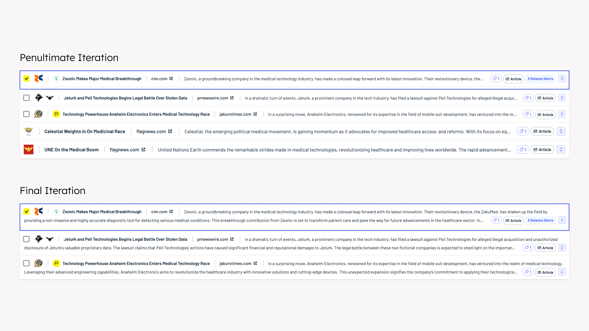
To the drawing board
The design passed through several iterations based on project requirements, business goals, and the following user insights:
1.
Experts valued having access to more data with minimal interactions
2.
The then-current version limited the ability to sort multiple pieces of intel at a time
3.
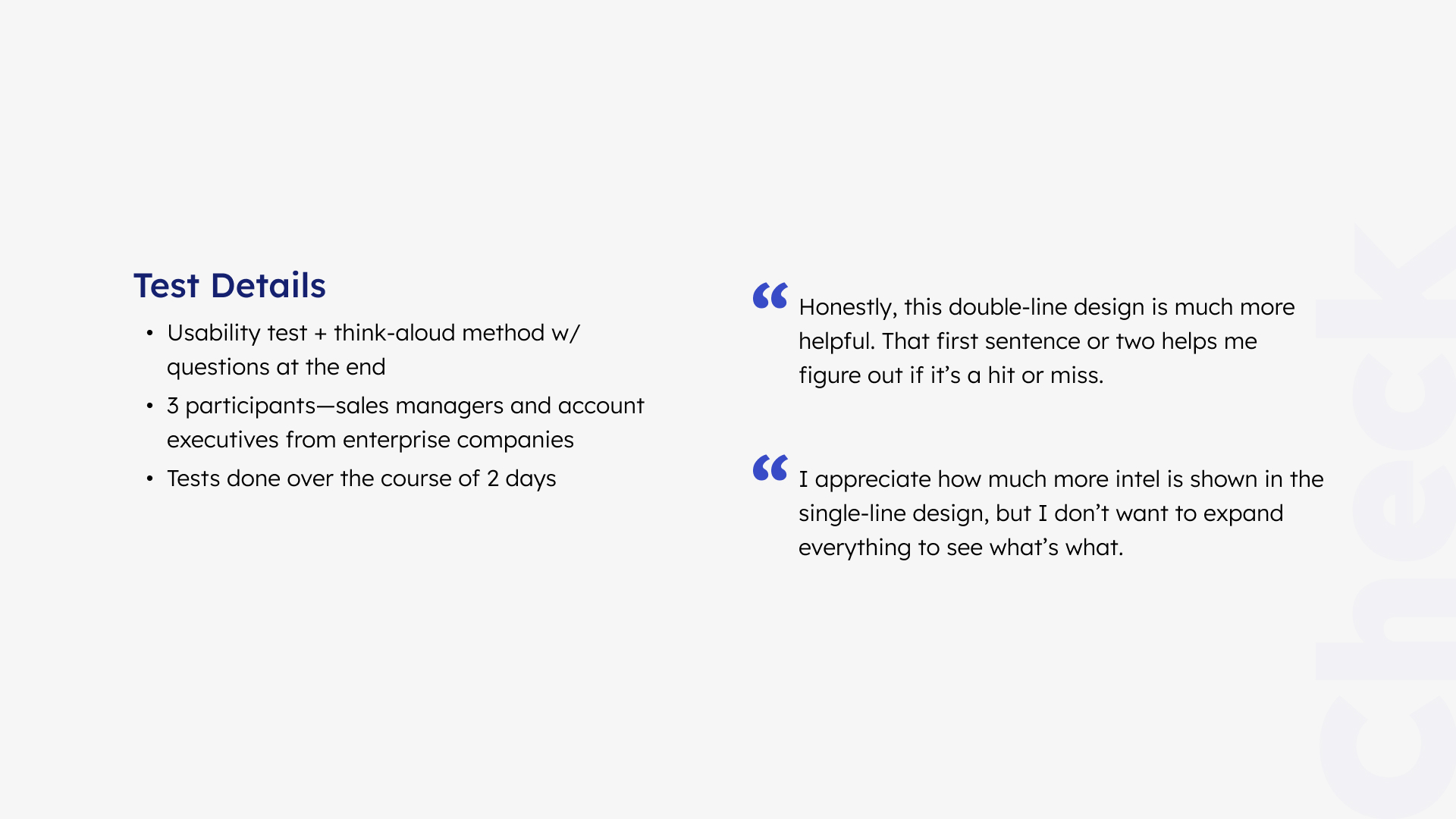
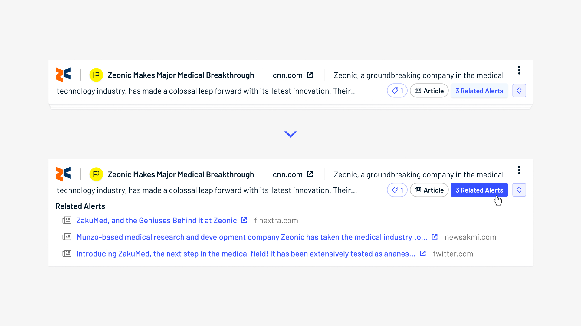
Users skim only the first 1-2 sentences to determine whether an article is relevant
Key decision
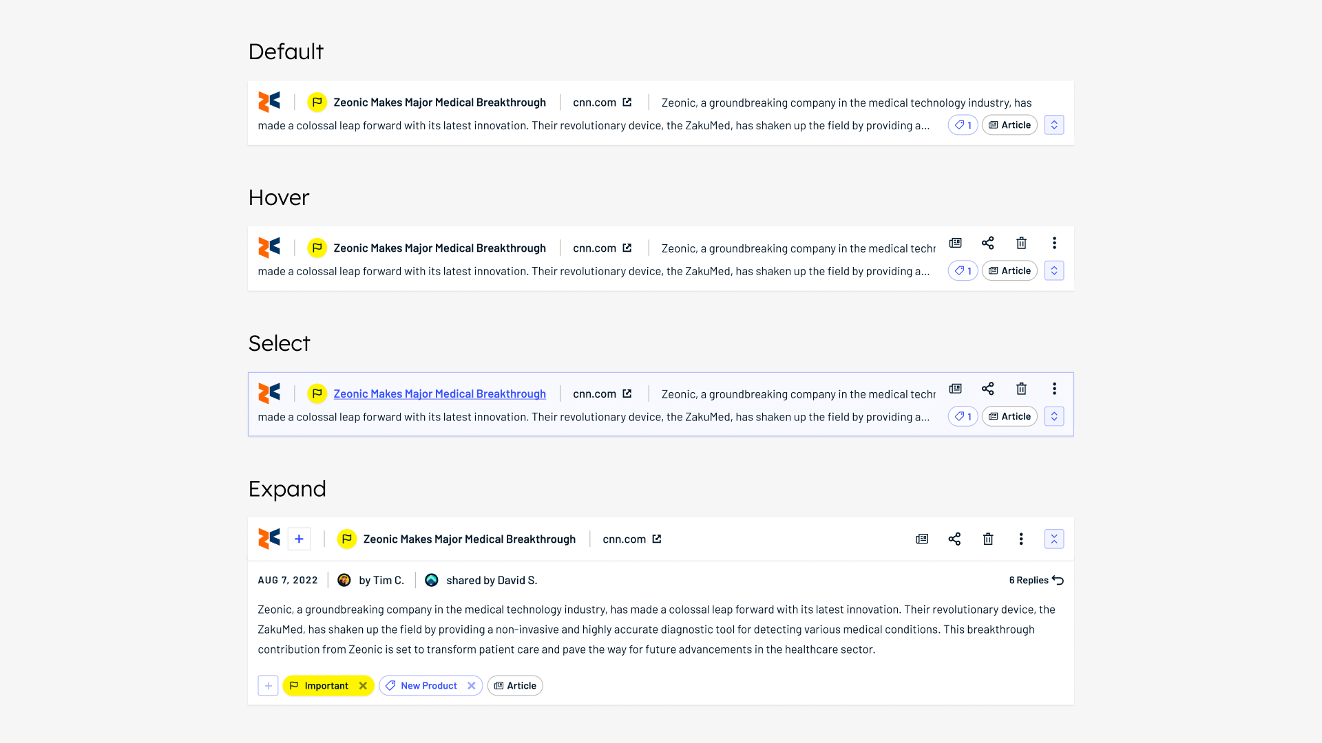
While I was hesitant at first as it seemed counterintuitive, adding a second line for content preview ended up improving scanability.

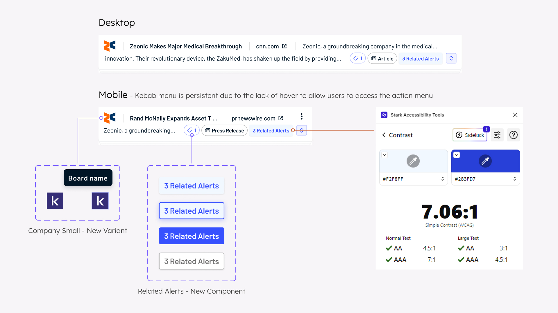
Design considerations
Existing components were leveraged to ensure WCAG compliance, though new components and variants were made where necessary. Documentation was also done to align design with code, and to save myself from PR review hell.
The Solution
Compact
Streamline work processes by tripling the amount of list items shown at a time, maximizing content while minimizing scrolling.
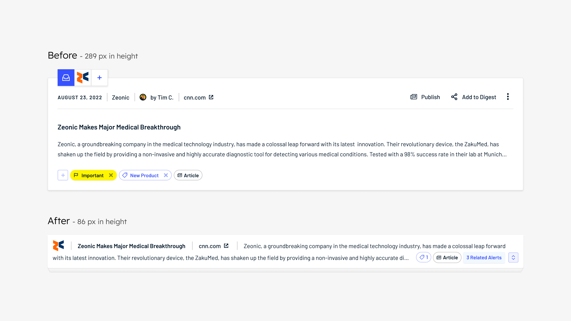
Digestible
The most critical pieces of info are shown at a glance, while the rest only appear when users take a deeper dive.
Synced
Coordinated efforts were made to ensure a smooth dual release with a closely related feature.
Scalable
Designed with future features in mind for easy integration—and to avoid pissing off the devs.
Final Thoughts
"Present designs early and often" was this project's mantra. Showing both good and bad iterations showcased my thinking, which led to more focused and productive discussions to arrive at a stronger solution. In an ideal world, however, testing with more demographics would benefit the final version of List View to help to consider all aspects of the design.