Klue Design System
A collection of design components I've created and maintained for Klue's design system volunteer committee. My efforts lead to a comprehensive initiative that revamped the process of creating and documenting components to standardize token properties, simplify implementation, and enhance the end user experience.
Role
UI/UX Designer & Design System Volunteer
Timeline
12 months (Jun 2022 - May 2023)
Responsibilities
UI & Interaction Design, UX Research, Design Component Creation, Documentation
The Results
•
75% increase in design component implementation speed
•
Promoted design consistency across 20+ features
•
Established foundational design system processes
“Your process is awesome. It's the gold standard that all
components should follow—Let them grow and expand organically, then normalize when it makes sense
to.
- Design Systems Lead
“This is huge. It's going to save us a ton of much time and
make aligning with designers so much easier.
- Lead Developer
The Goal
Lay the foundation of a unified design system to streamline development and elevate the core product experience.
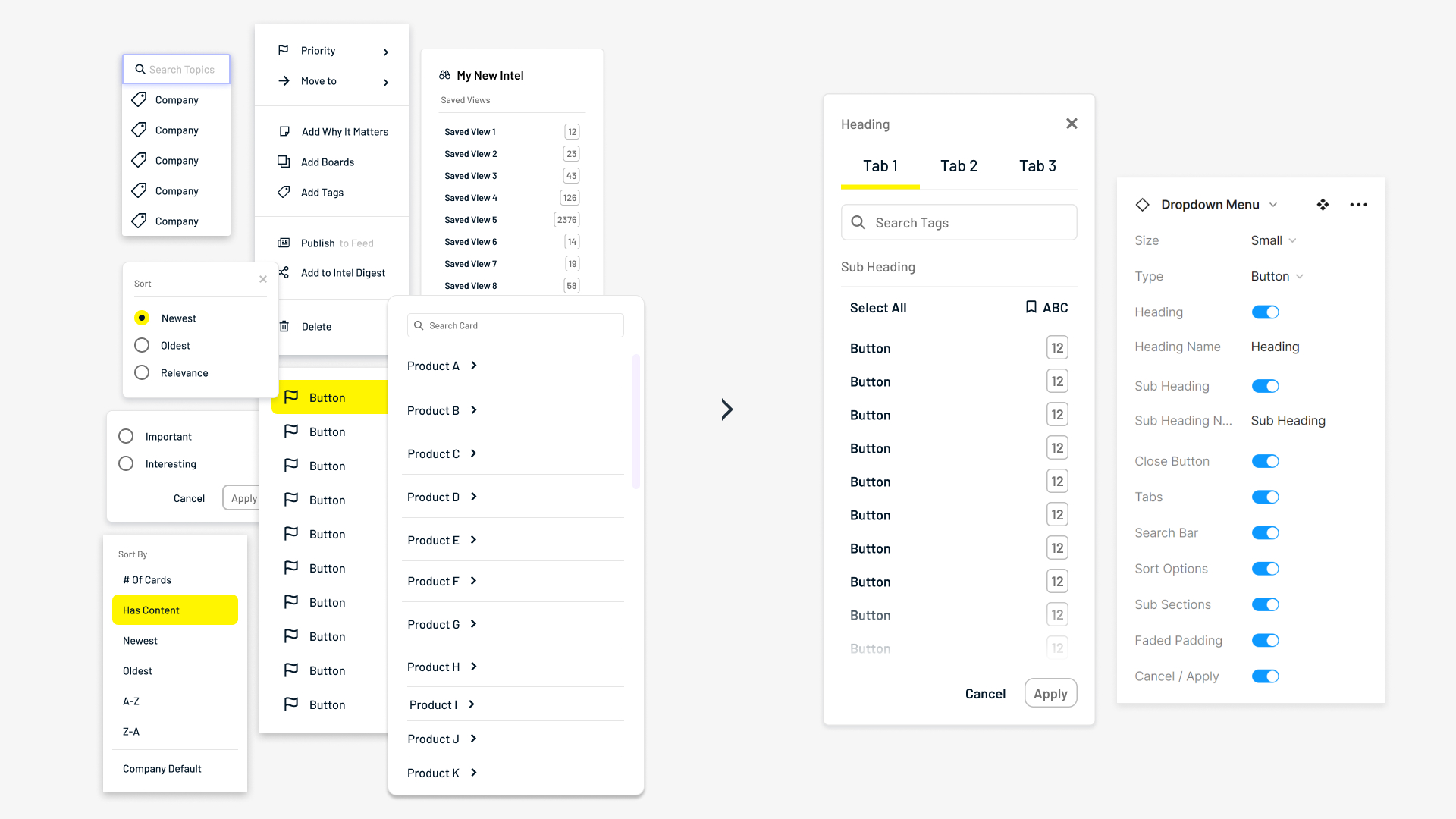
Why can't I hold all these properties?
Auditing Klue's products, I found numerous inconsistencies across components. Variants had wildly different combinations of spacing, sizes, and elements, most likely because many were designed from the ground up for each project.
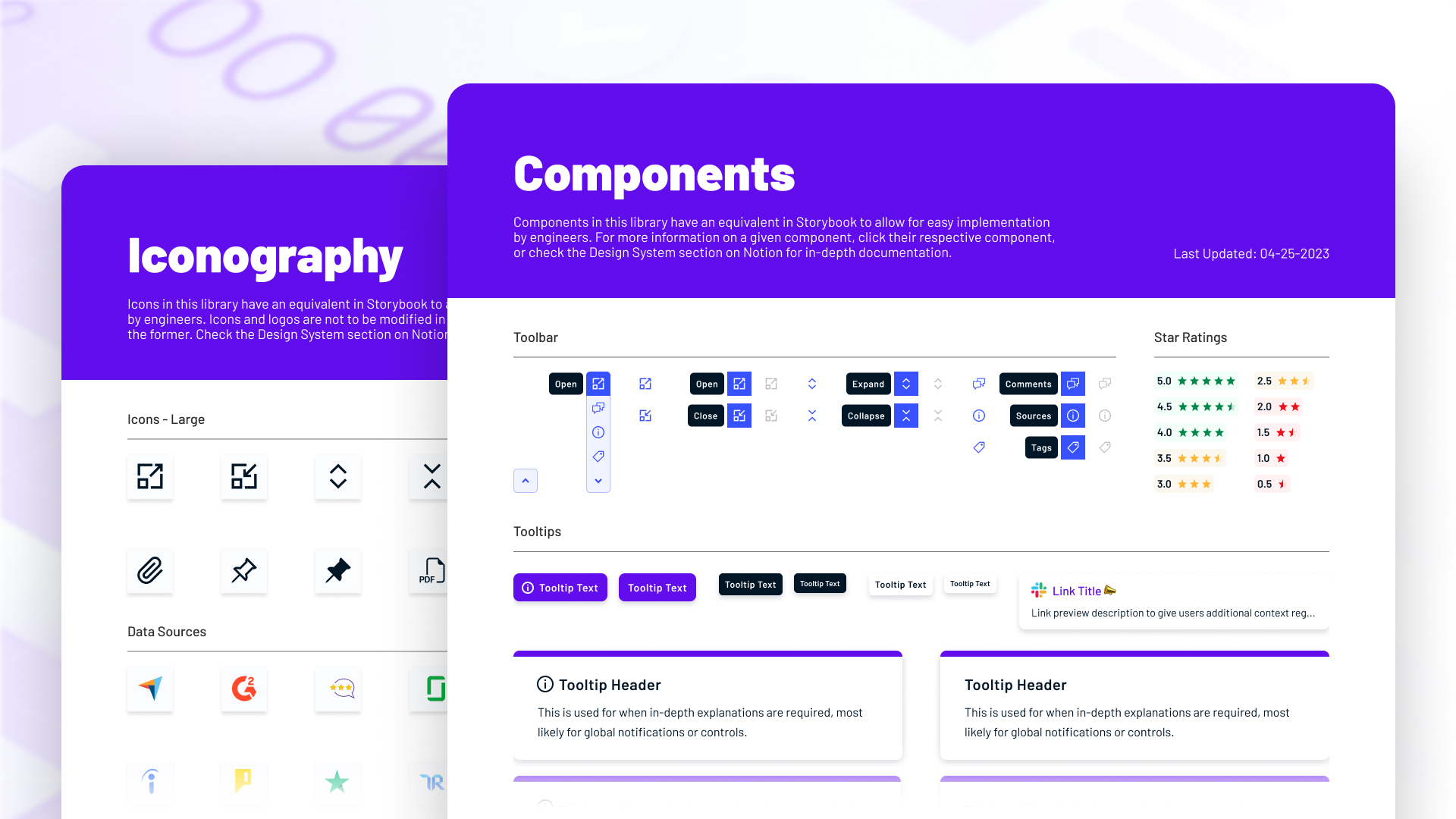
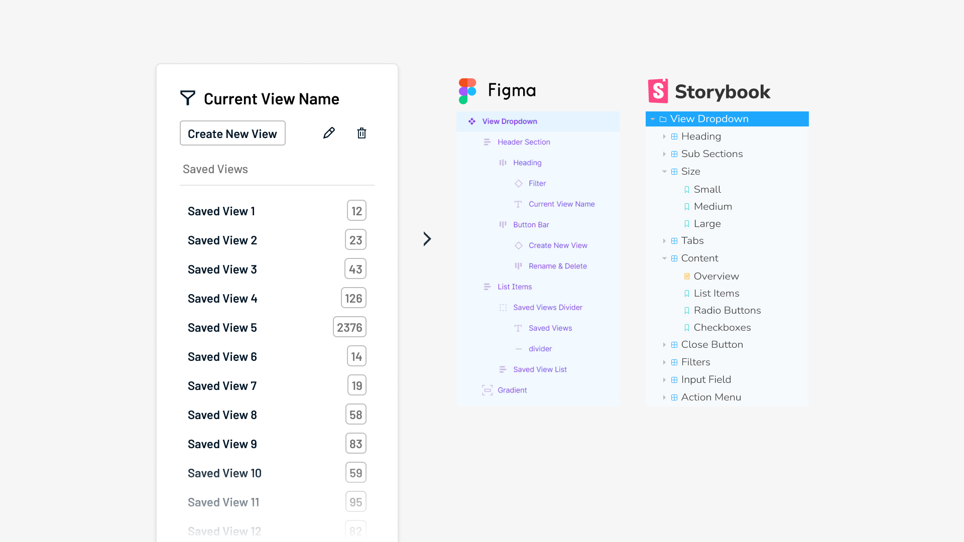
One component to rule them all
I condensed components and variants by leveraging the then new Component Properties feature to make base components more robust. This streamlined the ideation and iteration process for fellow designers.
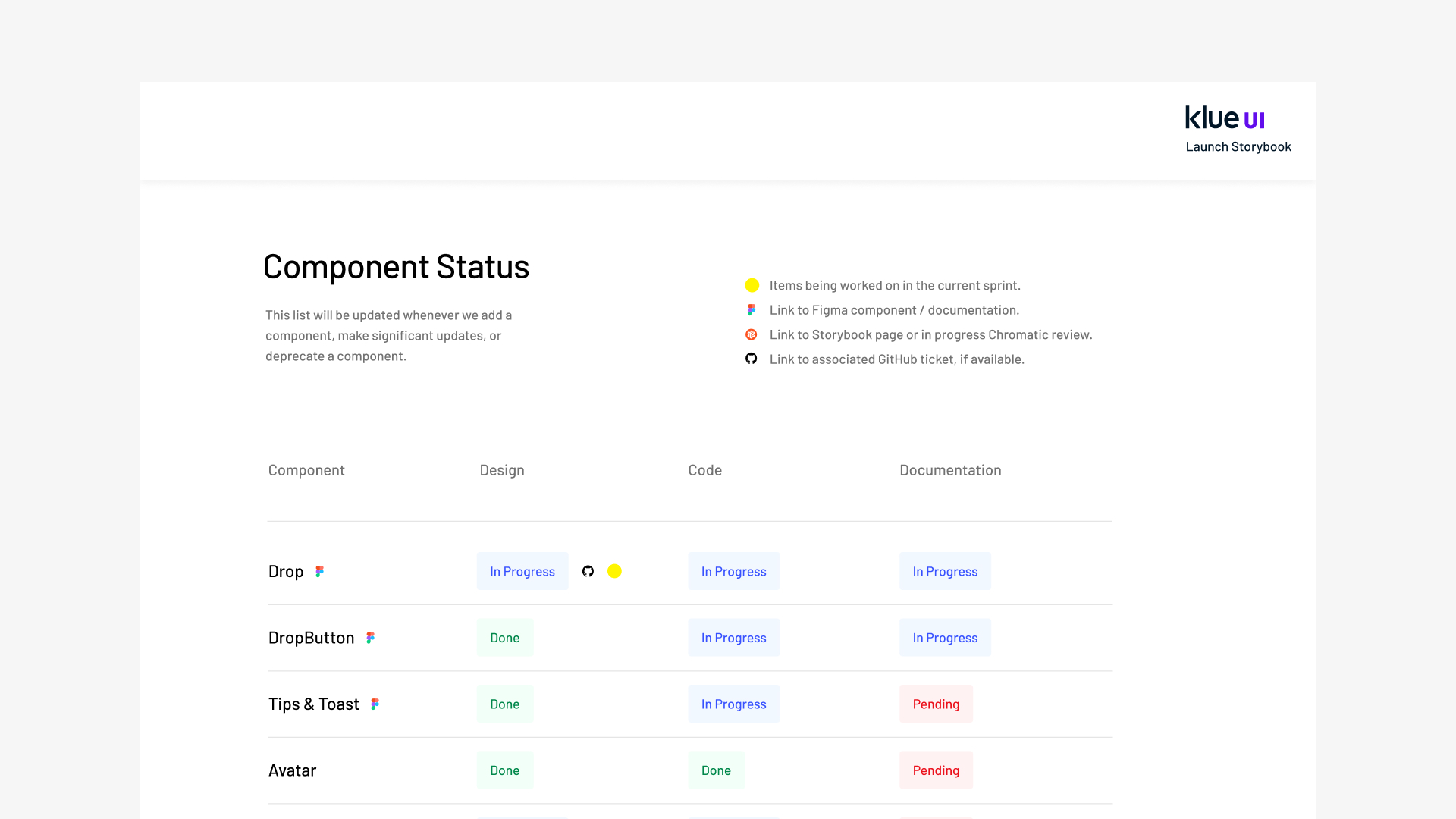
He is speaking the language of devs
Laying the foundation of a unified design system across design and code, base components were created to enable easy adaptation for future work. I also collaborated closely with developers to align design and code versions of components.
The Outcome
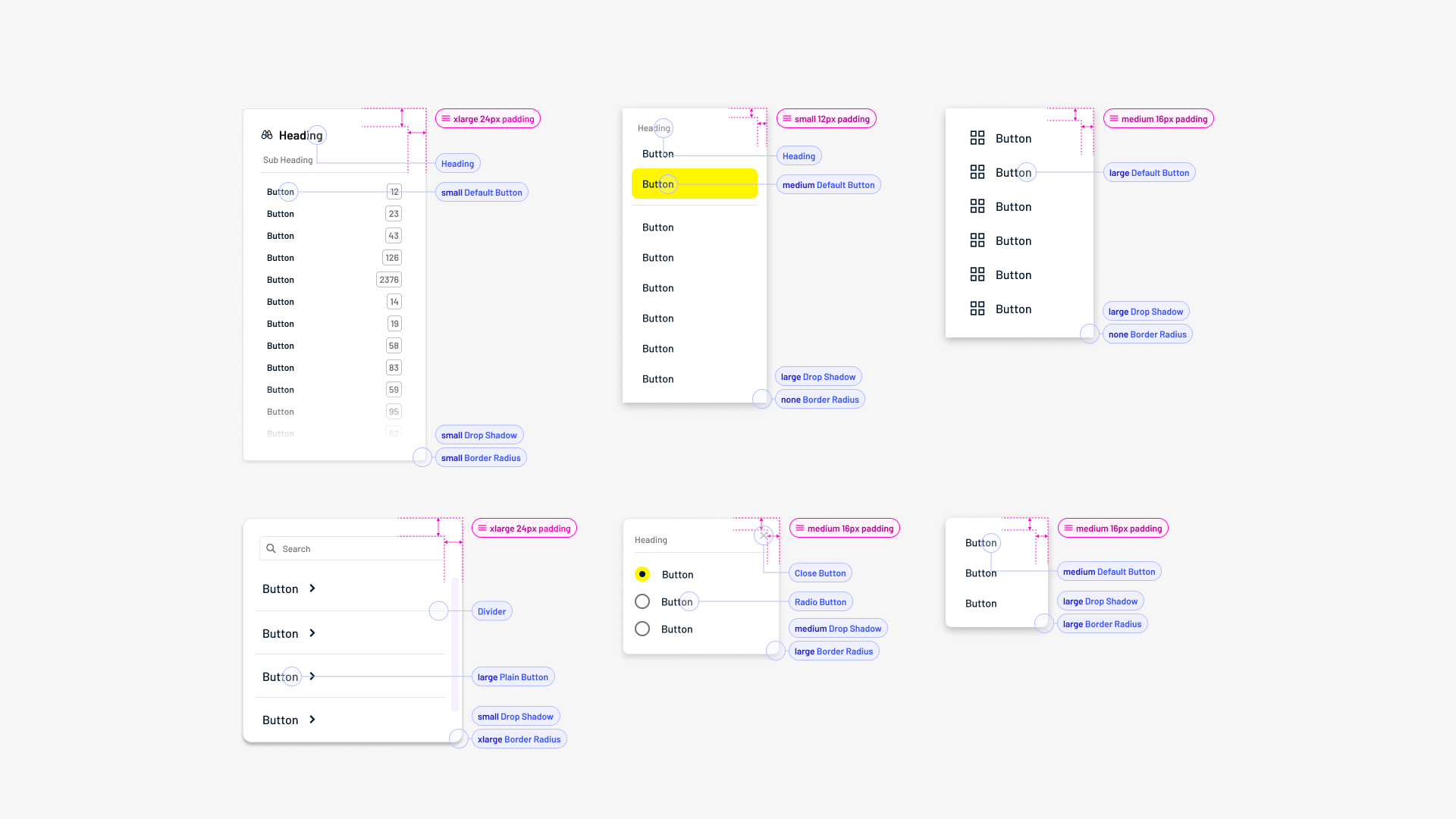
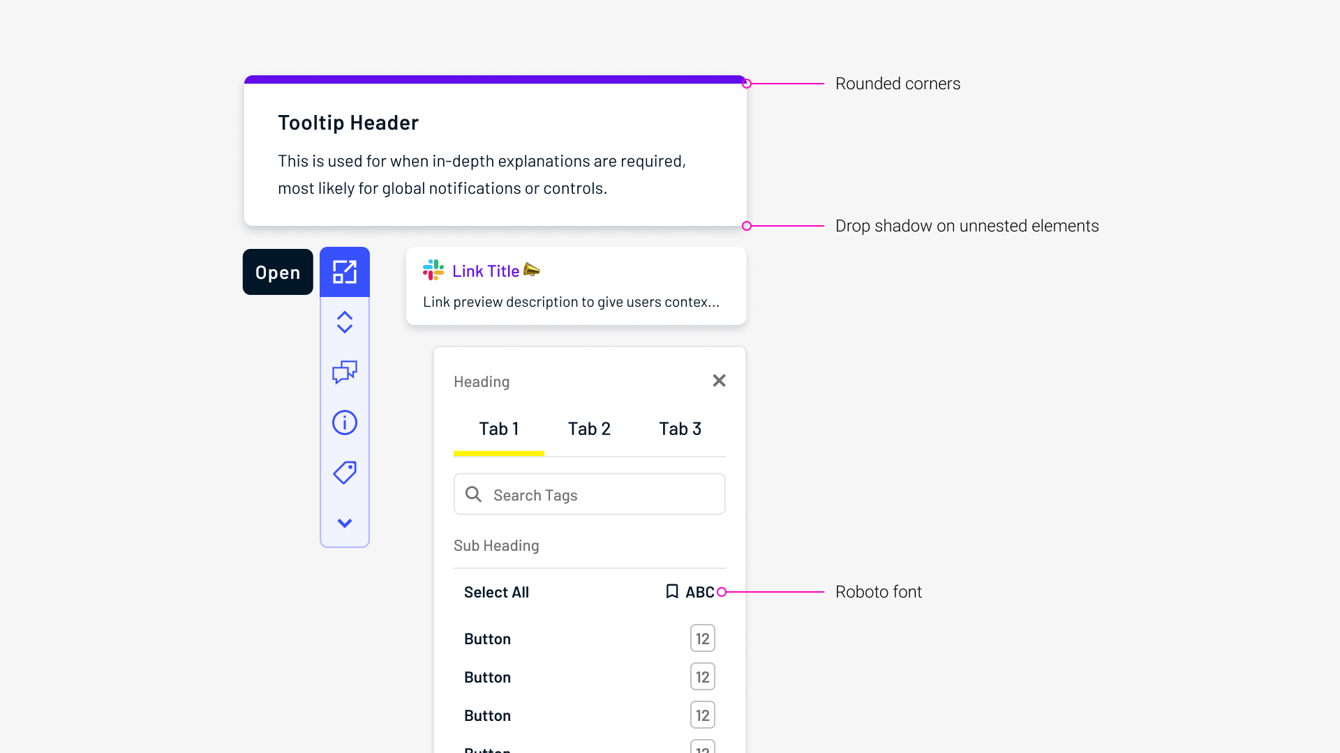
Branded
Details like border radii and drop shadows were incorporated to establish a unified design language across components.
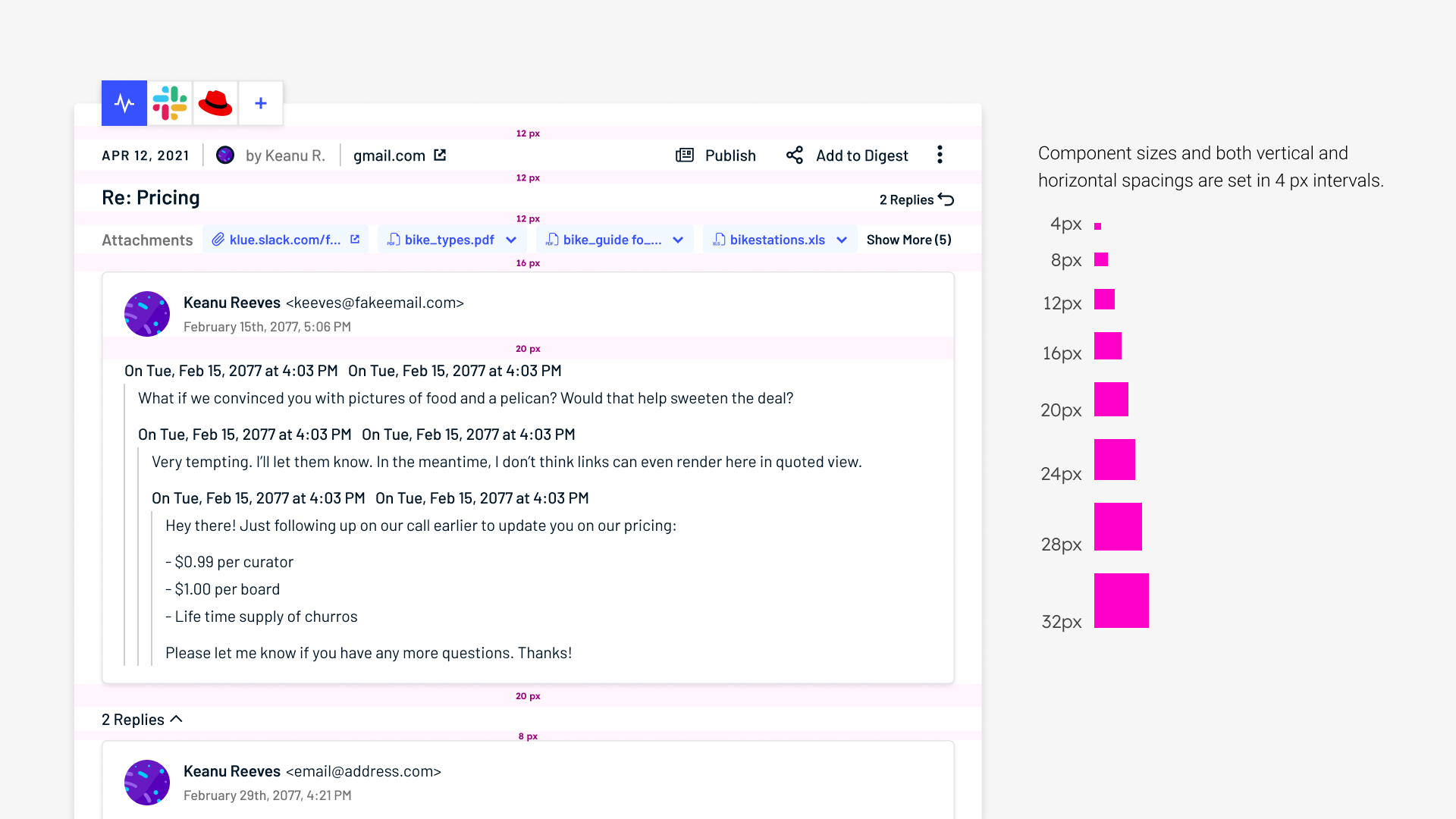
Tokenized
Token values in 4px intervals were used to determine variant sizes and component spacing.
Semantic
Colours were chosen to represent 'Klue's voice,' important and interactive elements, as well as semantic content.
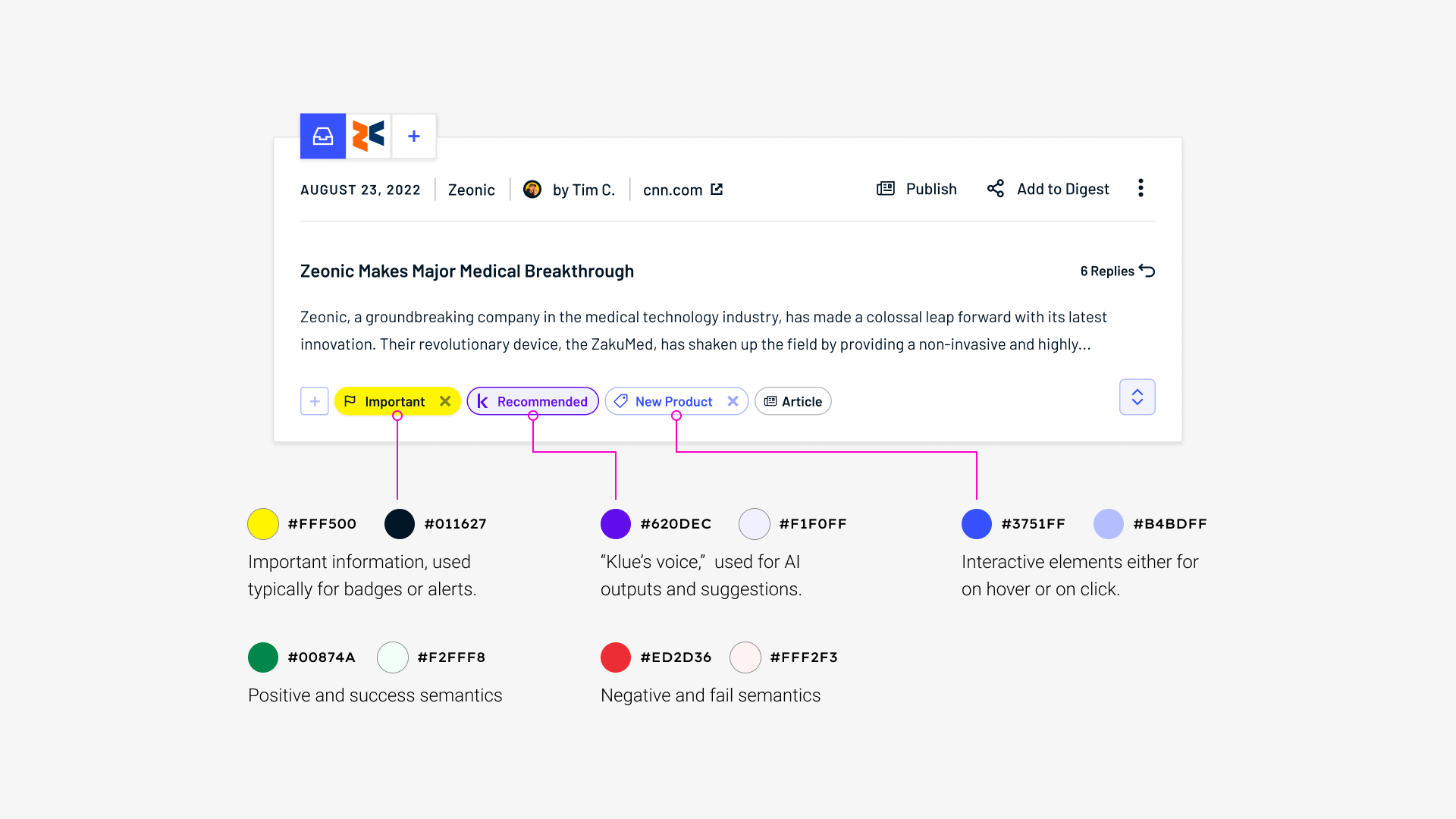
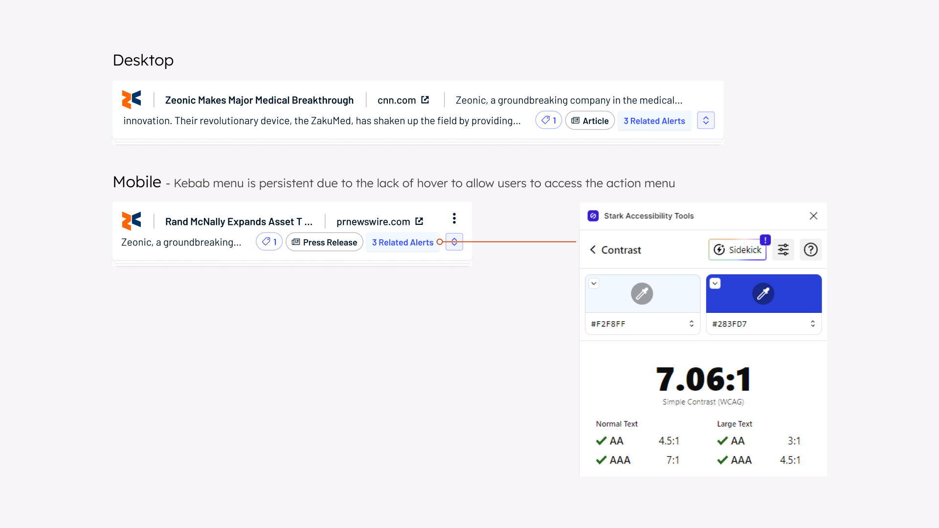
Accessible
Careful considerations were made to ensure designs are responsive and high contrast to comply with WCAG 3.0 standards.
Final Thoughts
As my first foray into design systems within a professional context, I had to learn how to effectively collaborate with developers to gain a deep understanding of their processes before I could help improve upon them. In retrospect, of all the components I created, I would have liked to rework the ratings component, as it uses semantic colours yet lacks any concrete positive and negative connotations.